Vary the type and scale of patterns used

Keep the patterns in a tight colour scheme - complementary is easy
Caitlin Wilson via Houzz
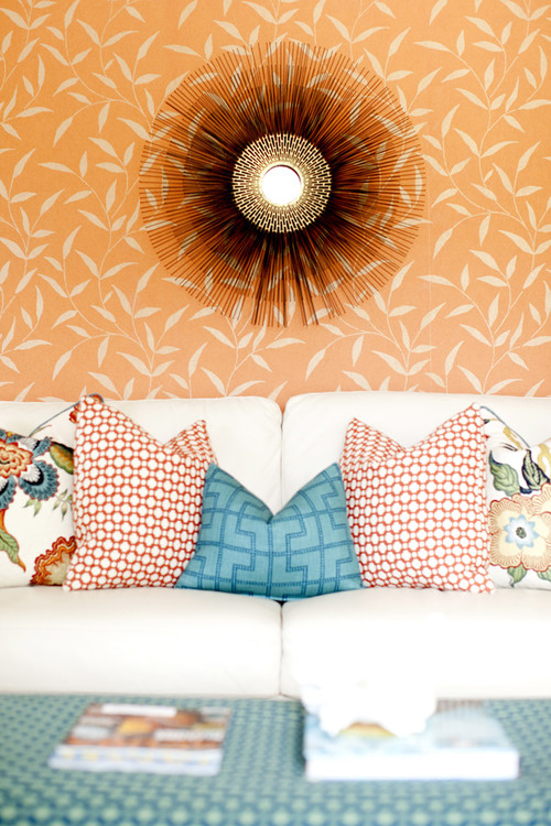
This is a more adventurous use of pattern when you consider the wall and the ottoman. Similar to the last arrangement, this one uses a large scale print as a departure point for the colour scheme. A smaller and larger linear geometric is chosen in complementary colours. If you want to have a lot of energy add pattern to the wall in yet another pattern. It's too much for me, but I'm pretty plain in my tastes!
Break up pattern with a solid
Z3 Diseño
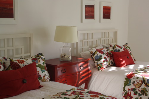
This is a pretty intense pattern but it is played down by using white and a solid colour in pillows. If the chest was painted white the pattern would be further controlled.
Play down colour, go neutral


Photography : Margaret Ryall
0 comments:
Post a Comment